Case Studies
Provider Search Admin Experience
Company
Cleveland Clinic
My Role
Lead UX Designer
Collaborators
Researchers, A junior UX Designer, Product Managers, Engineering
About the Project
At Cleveland Clinic the process for adding new physician profiles to our provider search directory and maintaining them was a dated, inefficient experience. I was tasked with leading the visual design of a revamped version of this workflow. The product was designed to enable administrators to manage provider data accurately and efficiently within a highly regulated environment. The project required balancing usability, data density, accessibility, and evolving stakeholder requirements under significant ambiguity.

Wireframes
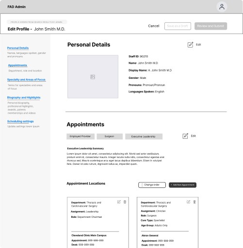
Our researchers conducted exhaustive set of user interviews with representatives within the organization of the four personas we were trying to accommodate with this initiative. Early wireframes focused on establishing a scalable information architecture that could support large provider datasets, frequent updates, and role-based permissions. This work informed a set of mid-fidelity wireframes that considered the entire experience.


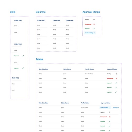
Components
A big part of this project was developing a dialed-back version of our consumer-facing design system, targeting more of an internal audience. One of the goals of here was to efficiently accommodate a breadth of data and information on each screen in a tighter amount of space without sacrificing accessibility considerations. As the design lead on the project I set an initial visual design direction, then delegated out key components out to my junior teammate as we collaborated to finish out our system.
Components were designed to be reusable and extensible, anticipating future expansion of the admin platform. I worked closely with engineering to ensure components were feasible to build and consistent with broader system patterns.


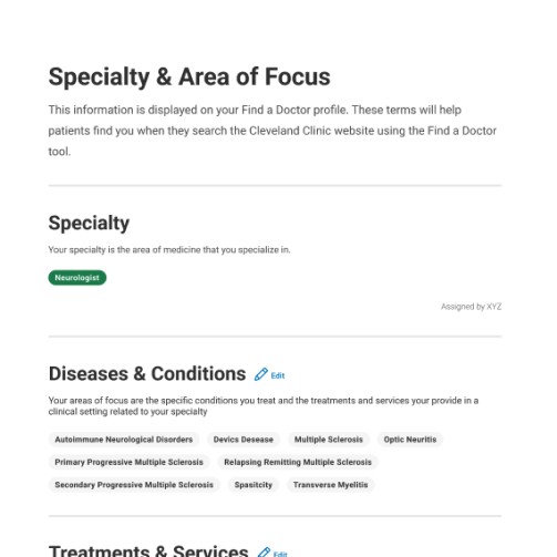
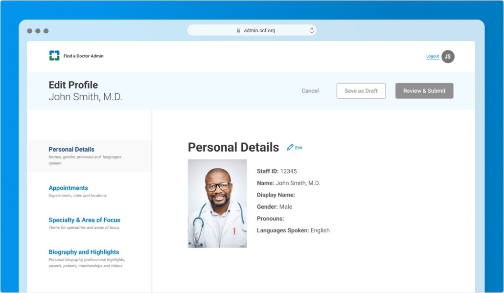
High-fidelity
Once the general visual design was squared away and the components we would use were built in Figma, we set out to design each screen. We created prototypes that could be used for user testing across four different personas.
For this portion of the project, I again collaborated with a junior designer delegating portions of the workflow to them providing feedback and direction. We frequently shared our progress with stakeholders during daily stand-ups.


Testing & Results
We created a set of 4 clickable prototypes. One for each persona. Usability testing and internal reviews helped validate key interaction patterns and identify areas for refinement. While the product ultimately did not launch, the work informed future internal tooling efforts and established patterns that could be reused across similar experiences and in other areas of the site.
Key Decisions Made
Prioritized clarity and predictability over customization to reduce cognitive load.
Designed tables and forms to support high data density without sacrificing scanability.
Standardized modal and edit patterns to reduce training overhead.